Friday, 14 December 2012

Sara Singh


As I am looking into historical and resent illustrators for my new brief I decided I would look at Sara Singh's work. I enjoy her work as it is all done freestyle and there is no neat lines and it all looks like an artist mess which is the style I prefer to work in.
 The media used by Sara Singh is ink and fine liner so it was a fun media to work with. I created some samples to see what brush size would be better to work with.


I found that using a smaller brush would create the better effect in the style of Sara Singh. I  think my recreation could have been created to a more professional standard, but I am pleased with the outcome. If I was to use this media in the same way I would create more samples so that I could produce my work to a higher standard.

Paul Iribe

I looked into a illustrator called Paul Iribe, I found his work interesting as a lot of it was to do with the world war. I found a piece of his work which stood out most to me and it was an image of Hitler. I then looked into the media that Paul used so that I could try and re-create this piece, I found that he made stencils and rubbed iron and copper shavings over the top of the stencil.


I then tried to create my own stencil using this image of Hitler that Paul used.


As I have never made a stencil before I wasn't sure what way to go about it so I created some samples to see which one would work best for the recreation.  I then got a scalpel knife and cutting board and got my drawing and cut the outlines out.


This is the stencil that I created using Paul Iribs method. I think that I gave it a good attempt but there is a lot of improvements that I could make so if I make a stencil again I will need to create a lot more samples to get the best outcome.

Tuesday, 20 November 2012

NOIR


Noir is an echo friendly fashion brand. Noir works with illuminati 2 using organic fabrics. The illuminati fabrics origin from a project in Uganda, which aims at expanding organic cotton farming they also help to educate the local community and the 4000 farmers employed in the project. The farmers employed in the project receive tools and education in organic farming and health care.
 Noir's work gives women the chance to express their feminine power through their fashion, not only does it express power but it's also very sexy with the cut out's in the garments and casual feel. I like the fact Noir can incorporate the sexy, powerful and casual feel to their garments and create such a dominant mood.

Golden Ratio

So over the past few weeks I have been learning about the golden ratio and how you use it, as part of my college brief. I couldn't really get my head around the mathematics and how they are used within the golden ratio.

To me the golden ratio means maths and numbers. The golden ratio helps proportion when drawing, i.e. the Moan Lisa was drawn using golden ratio. If things are in proportion and fit into the golden ratio then it's thought to be more pleasing to the eye even the human figure. Before I had received this brief I had never heard of the golden ratio but as I learnt more about it I thought it was interesting but also quite confusing. I think with a little more understanding of the golden ratio I will try and use it in some of my own work to see if it could help me.


Friday, 28 September 2012

Princess Of The Ball

Well I am one very excited young lady as I have been invited to a party in a castle. Not any old castle but pekforton castle

 How lucky am I, it's such a beautiful place. The only dilemma I am faced with is WHAT DO I WEAR ! I didn't realise how hard it would be to find the perfect cocktail dress which say's WOW ! So I found a very old purple body con maxi dress, which I have decided I will sew crystals on to. I am not going to put the crystals on the dress so they cover it and look over the top I am going to graduate them so they are in bulk around the hem and reduce to less and less as they travel up the dress. Hopefully I can get this done before November.

Image to be uploaded.

SHOES SHOES SHOES...

KG Kurt Geiger Hot Women Brands KG Kurt Geiger 
COME TO TASHA !!! Well the only way I could possibly describe these shoes is OUT OF THIS WORLD. Love at first sight not only are they my favourite colour but they are perfect to wear with most outfits and would just make a little black dress. I would die and go to heaven if I could afford these shoes pay-day could not come sooner as they have just been put on sale, reduced from £140.00 to £39.00 could this sale be any more perfect ! Well yes if Kurt sent them to me for free a girl can only dream.
http://www.kurtgeiger.com/women/hot-20.html

Thursday, 20 September 2012

The One's Who Inspire

Lily Melrose
http://www.llymlrs.com/

Lily's blog is the one I go to for fashion inspiration she's posting endless blog's about her fashion purchases and how to wear them. Most of the time I want everything that she wears she has a very grungy yet vintage fashion style and she wears them to make fashion statements but doesn't look outrages. Lily always lets you know where she has bought her outfits from and the accessories.
 As she is a professional fashion blogger she gets invited to lots of very exciting events her most recent being to London fashion week, I guess it's like getting the first look on the cat walk as she posts photo's throughout her day.


Ring My Bell
http://ashley-ringmybell.blogspot.co.uk/

Ashley Madekwe is an actress from London now living in LA. She has recently started in the tv series revenge. Ashley blogs are based around her own everyday fashion that her and her stylist puts together she always in LA with the beautiful sun shining. She wears a lot of high street fashion but adds little snip its of designer gear LUCKY GIRL ! Ashley always say's were her outfits our from and if sold out or one of a kind she finds similar designs, colour pallets and as identical as you can get outfits and lets people know where they can get them from so they don't miss out. You can also contact her assistants and management or her blog direct if you would like to some how get hold of her. Also Ashley  allows her followers to apply into competitions to win prizes. This blog is the blog I look at most of them all purely because I Ja'dore Ashley as an actress but I always want to know what she is wearing and were I can go to get it well if I had me some pennies that would be. 

Topcoat
http://topcoatfashionblog.blogspot.co.uk/p/about.html

Arden Rubens is a fashion blogger, her home town is in Miami and Israel as her residence. Her blogs mainly consist of catwalks that she takes an interest in and fashion editorials and fashion stories from vogue. Also she takes lots of photographs of street style which is quite inspiring for putting together you're own high street wardrobe. She tries to add some interior home inspirations this could help with ideas for designing a new home or even to take designs shapes and styles away to put into a fashion collection.

Wednesday, 12 September 2012

Imperial War Museum North.

I took a trip down to Manchester as my dad told me about the Imperial War Museum and thought I could take alot of inspiration from the visit. He wasn't wrong I was blown away by the museum it was incredible they had something from every war starting from the first world war to the war in Iraq today. As I walked into the museum the first thing I came across was a sculpture called The Crusader a spectacular seven meter high sculpture by artist Gerry Judah. His sculpture was his own summery of what he thought of the war and how he took it. My first take on the sculpture before reading what it was meant to represent was that it looked like a million spider legs all stuck to plaster of paris only to discover it had nothing to do with spiders.
Image of Sculpture on display in the Main Exhibition Space at IWM North

I also came across what looked like a pile of burnt metal which was actually once a car. The car was destroyed by a bomb in a market centre in Baghdad on the 5th March 2007.
Image of the car damaged by the Al-Mutanabbi Street bombing

There was so much to this museum I could have spent all day there but I couldn't.

Crosby Beach !

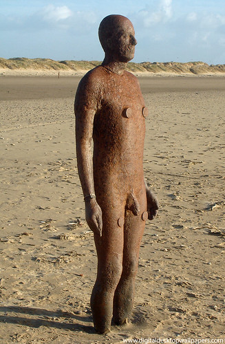
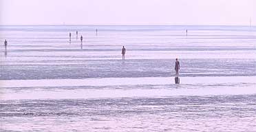
Possibly one of the best days out iv'e had. Over the summer holidays I was dragging my dad here there and everywhere, which he wasn't to excited about due to the price of diesel but I managed to get him to a few places. Crosby beach has always been on my to do list of things I need to see ! Iv'e always seen images of it and thought how wonderful it looked and I finally got to go see it for myself. I was so impressed by the statues and they way they were eroding gracefully. All the statues are placed around the beach at different heights some of them are at waist hight and some of them our raised and about 6ft. As I wasn't sure how many statues there were I attempted to count them but there really was to many and there was new ones appearing further out in the distance. Here is a little on the artist who created there magnificent sculptures of himself. 

Another Place consists of 100 cast-iron, life-size figures spread out along three kilometers of the foreshore, stretching almost one kilometre out to sea. Contractors spent three weeks lifting the figures into place and driving them into the beach on the-metre-high foundation piles.

The Another Place figures - each one weighing 650 kilos - are made from casts of the artist's own body and are shown at different stages of rising out of the sand, all of them looking out to sea, staring at the horizon in silent expectation.

Iron Man on Beach   

I am really lucky I got to go see the statues and will most definitely be visiting there again apart from the chips were RUBBISH so I will be taking a picnic this time !

Sunday, 10 June 2012

Creating My FMP Toile

I pinned all of my pattern pieces on to the calico and cut them out. I also colour coded these pieces to avoid getting them mixed up and so I knew what piece went where. Once they were all cut out I started to sew them all together. Before I could sew the entire dress together I had to sample curved seams to make sure I knew what I was doing. This went well and I felt confident to stitch my toile together.

I started with the two centre back pieces first because it would mean that the shape of the skirt would form properly. I decided to sew the skirt first and then the bodice afterwards. The neck piece of the bodice had to have two pieces as I was planning on stuffing it. I had already sampled using the wadding for the stuffing of the neck piece. I wanted to stuff the neck piece of my toile but unfortunately we sewed the bias binding on to the neck piece before we remembered it needed stuffing. This is not too much of a problem because I am quite confident it will work first time on my final dress. I had to make my binding for this toile because I didn't have any but I'm going to try and buy some for my final dress as this will be much easier and will take less time.

My next step was to sample the tentacles of my dress. I did this by ripping chiffon. I then pinned together the waist bands of the skirt and bodice and wedged in my sample tentacles to see if it looked better on the outside of the skirt or sewed on to the hem of the skirt which i also experimented with. Another experiment was stitching the end of the tentacles to the waistband and hem but the best experiment was when I stitched the tentacles to the inside waistband of the skirt. This allowed the tentacles to hang lose on the inside of the skirt before dangling out from under the hem at the bottom. This fit in with my original design idea better.

My next stage was to put the zip into my toile. I used a concealed zip, placed the zip foot on the sewing machine and placed the zip along the section I'd left on the bodice. The zip was too long and so I had to alter it first and make it shorter I found when I had sewed the zip in that I had sewed it in too low. For my final dress I will have to make sure I measure exactly where the zip needs to go and be more accurate to stop this happening again.

I then sewed the waist of the skirt and the bodice together. Unfortunately the seams on the panels didn't quite match up and so I need to make sure that on my final dress I am more accurate with my sewing. Another issue I had was that the bodice was too big around the top part which meant it gaped slightly. I will have to reduce all of the front bodice panels by 1/2 cm so that it fits better for my final dress.


Thursday, 7 June 2012

Patterning For My FMP Dress

To start with I had to change the design of my dress as it was to similar to another students and I wanted it to e more unique. I changed the shape of the skirt into a bubble.
This was my original design.

To start with I measured the bodice measurements on the mannequin with help from my tutor. I had to figure out how I wanted the bodice to fit. I wanted it to be a strong structure and fitted to the waist.

My next step was to take the patterning paper and draw free hand around the mannequins neck to get the correct shape and size. This went well and I had no problems.

I traced a bodice block and from this I started to draw out my bodice pieces. To do this I got pattern paper, took my measurements and drew the shapes I wanted. From discussing techniques with my tutor it was decided that due to the shape of the bodice I would need to panel the front top part of the dress. I needed to panel the bodice to make sure that it fitted around the bust of the female form. I had to ensure that the two outside panels were wider than the two inside panels.

I then went on to make my back pattern piece. I did this by measuring around the back of the mannequin to get the correct measurements. I decided on just producing one panel piece for the part of the bodice rather than different panels like with the front because I felt it fit better with my design and looked more feminine.

My next step was to work out where I wanted the zip on the dress and how high it would go up the body. The fit of the dress would be tighter with the zip so I had to bear that in min. I allowed a 1cm seam allowance all the way around my dress. I decided to put the zip on the left of the dress because I felt there was already enough going on, on the right side of the dress with the neck piece. It also made getting in and out of the dress a lot easier as you weren't having to negotiate the neck piece.

I know started work on my skirt piece. I wanted my skirt to be longer at the back and shorter at the front. I measure a student who was roughly the same height as the models we would be using in the show and decided that the back of my skirt would measure 80cm and the front should measure 50cm.

To create the pattern pieces for my skirt I trace a skirt block and then adapted it to fit with my design. Again I decided I would need to panel my skirt to create the shape I wanted. I drew out my seam allowances and started to draw out the panels from my traced skirt block. Each panel got longer from the front to the back to create the asymmetrical shape. The panels were also drawn wider in the middle to create the bubble effect.

I then needed to make sure that the waist of my skirt and the waist of my bodice matched up. I measured both an realised that the waist of my skirt was 1cm bigger than my bodice. The darts on the skirt were set to 2cm an so to reduce the length I reduced one of the darts at the back of the skirt to 1 cm so that the entire skirt waist now matched up with the waist of the bodice.

I redrew all of the panel pieces of my skirt to get the adapted basic shape of my skirt. These were my second raft pattern pieces. I then colour coded these pieces to help me match them up an to stop me from getting confuse. I also did this on my design so that I had a guide to work to. I then pinned my pattern pieces on to the mannequin to check I was going to end up with the correct shape I wanted. It was perfect and I was happy. 
 

Tuesday, 22 May 2012

Skirt With Yolk

The skirt with a yolk is defiantly the most challenging skirt I've had to manufacture yet. The reason it was so challenging was because i had to add
  • Yoke
  • Box pleat
  • Kick pleat
  • Concealed zip
It come with great difficulty to manufacture this skirt not only is there more pattern pieces but more maths to go along with it !!! Maths certainly isn't my strongest point. Here is how I manufactured the skirt with a yoke:
  • I drew around my skirt blocks adding a box pleat.
  • I added flare by extending my hem and drawing a line from my new hem to the hip line.
  • I traced the yoke and closed the darts then re-traced the new yoke and added a 1.5cm seam allowance.
  • To create my front skirt piece I traced of my first draft and measured the box pleat 4cm and timed it by 3.
  • I taped it to the edge of my pattern piece and folded equally and created notches. I added a 1.5cm seam allowance and cut it out.
  • To create the kick pleat I got the back piece of my skirt and traced the first draft to create the kick pleat I drew a 20cm line and marked of CB adding a 5cm along the bottom.
  • I then added a 1.5cm seam allowance and cut it out.
  • I then placed all my pattern pieces onto my material and cut them all out and manufactured the skirt.
Pictures to be uploaded soon

Thursday, 17 May 2012

Dress With panels

I traced around a dress block,  then drew in my design lines from the top and bottom of the dress darts on the front and back pieces. After I drew my design lines I drew 2 panels on each pattern piece.


I then traced both panels, marked all lines and notches and added a 1.5cm seam allowance. The left  front dress pattern pieces, the center front pattern piece will be cut on fold..


Next was to create the facing patterns to do this I taped the patterns together at the shoulder as they would be if I were sewing them together, I then drew a line with about 5cm distance from the seam line around the arm and the neck of my patterns. After that I drew around the facings I just drew and added a 1.5cm seam.        

 I sewed my front pieces together, I sewed my side panels of my front dress pieces together first and then I sewed the center front panel matching all of my notches. To sew the  curved areas I had to make notches as the fabric was very tight otherwise the pieces wouldn't have fitted together.

I then sewed the sides of my dress together instead of doing it after everything else just to make life easier for myself.

I then sewed the neck facing on to do this I first overlocked the  edges, then pinned the facing on to the neck and sewed so the edge was over lapped by 1.5cm. Then I cut the seam in half, sewed a retainer stitch on the facing and ironed the facing on.

The arm facings  overclocked, and then sewed the edges together with a 1.5cm seam allowance, and then sewed a retainer stitch for both arm facings.  I then pinned to the fabric making sure the back piece of the facing matched the back of the arm and the front and the same again with the neck facing.

I am very pleased with my final outcome I didn't really know what to expect with the dress but I was surprised with myself as it went well. I would pick a different dress design next time as this one isn't really me and I wasn't fond of the material but as it was my first time making a dress I am really pleased with myself.
This is an image of my final dress
There are more photos to come but due to having problems with my camera I am unable to upload anymore pictures.


Thursday, 3 May 2012

Banksy Umbrella Girl ReCreation

Task 4 was the final shoot in which I had to recreate another artist's work. We had to take inspiration from our contextual studies book and pick an artist who we had already researched into and liked their work. I chose Banksy and his image 'Umbrella girl'. I chose 'Umbrella girl' as I thought it would be really good and challenging to recreate and I was right because the image wasn't of an actual real life person and it was a painting of a young girl. This meant that I couldn’t create some of the features with a real life model. Also I couldn’t find a young girl to model for me so I had to use my friend Jessica. I overcame the problems I was faced with and did the rest of the preparation and planning and when it came to the day of the shoot I was ready. I enjoyed doing this shoot it was my favourite one of them all mainly because I love Banksy's work. I had problems with trying to get my image printed in A3 as the photographer who helped me with my shoot was unable to email me the file on time. I think the target audience for this would be male and females aged 18+ years on the high street. I was very pleased with my final recreation image and it turned out better than I would have imagined it to.
Here is my final recreation of Umbrella Girl- Banksy.
This is the original Banksy- Umbrella Girl
Task 3: I was given a word/theme which I then had to create a story with using props, hair, makeup and a studio that I set up for myself. I had to experiment and plan before creating the shoot, using a variety of techniques to create different messages. The first word I was given was EXPLOSION. I had to research into what explosion meant and what I thought and explosion was. Then with that research I planned out how I wanted my shoot to go such as the hair, makeup, backdrop, model, clothes, colours, etc.. I then went ahead and created a shoot. I also had to research the psychology of colour so I understood what the colours actually conveyed. I really enjoyed this task as I hadn't done a photo shoot before and it was exciting. I liked the freedom and creativity that came with it. I didn’t do as much planning as I should have done which had its downfalls when it came to doing the shoot. Creating the ideas for the shoot and being able to do what I wanted was really exciting, although I feel I could have gone out of my comfort zone more.
We were told to watch a short film called Le Balloon Rouge (Red Balloon). The film didn't have much dialogue and there wasn't very much colour apart from the red balloon. The film is about a little boy who finds a red balloon only to discover the balloon has a life of it's own and follows him around everywhere. Other little boys try to steal the red balloon from the little boy who had found it. At the end of the film the red balloon shrivels up as though its about to die. After the red balloon dies a whole bunch of balloons appear out of nowhere and take the little boy off into the sunset. After the short film we were told to create a story of our own taking inspiration from Le Balloon Rouge which was challenging. I enjoyed creating this story and I used my friend Pippa as the model and I made her look like she was from the 1950's standing in a park. Next to her is a red balloon floating around as though it has a mind of its own just like the one in the film.

Comparing Two Stylist Work

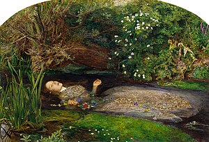
I had to find two stories from different stylists and compare their work producing a 250 word written piece. I had to explain how the stories were different such as the lighting that was used and then the model's poses. I had to consider what they conveyed and the messages behind each story. This was also very difficult for me but with the list of questions from the previous task I managed to understand what I was talking about. I compared Grace Coddington's 'A Winters Pale' and Katie Grand's 'What Lies Beneath'. Both of these stories are inspiring to look at with the use of lighting and colour used in different ways to set the moods of each show and it makes them both dramatic. My favourite one of the two fashion stories has to be Katie Grand's 'What Lies Beneath'. The feeling it gives you just from looking at it is incredible, it reminds me of an enchanted forest. Katie took a lot of inspiration for this shoot from a Shakespere play called Hamlet and a character called Ophelia. The image of Ophelia is now a famous image of her floating down the river. The below painting depicts this and is from the Pre-Raphaelite Brotherhood and was painted by John Everett Millais.
Grace Coddington and Katie Grand work in very different ways. I personally think that Katie Grand is more daring that Grace Coddington with the way she conveys her work. 'What Lies Beneath' is a great example of that as she chooses to have naked models in and around a lake and takes her inspiration from famous plays like Hamlet and the Pre-Raphaelite's work. Grace Coddington, on the other hand, is daring but plays it safer but she creates some beautiful work and meaningful stories.

Fashion Stylist

I was given a number of tasks to complete. My first task was to research into a number of stylists and their work and analyse the messages and stories behind each story. I was also asked to work out who was their target market. The stylists I looked into were called:
·         Grace Coddington
·         Katie Grand
·         Katie Shillingford
·         Robbie Spencer
·         Camille Bidault Waddington
This task came with great difficulty as I found it hard to look at other people's work and find out what the meaning is behind it and the write about it. I overcame this problem with a list of questions to ask myself. The questions I asked were:
  • What does the lighting convey?
  • What do the colours convey?
  • What props are used?
  • What do the  model's poses convey?
  • What do the model's facial expressions convey?
  • What is the target audience?
  • What does the model's age convey?
 I was really inspired by some the stories I researched into. I thought Grace Coddington as a stylist is very inspirational. Before we started task 1 we watched a documentary called the September issue, which showed us the life of a stylist and the process they go through before they create their shoots. Grace Coddington was the stylist in the film and I think her style of work is incredible. I have learnt how much hard work goes into being a stylist as before I didn’t really understand the job role. From learning about what a fashion stylist does and watching the September issue it has changed my opinion on what job role i would like to do in the fashion industry, as I am now considering going into styling myself.

Thursday, 19 April 2012

Manufacture Of Shirt.


Well this was one of the most confusing tasks I have been given. The process of manufacturing a shirt is actually very difficult, due to the cuffs and collars. I found creating the shirt was very confusing as there are so many parts to put together and lots of measuring was involved and that is my weakest point. Although I did like the end result I felt very proud of the shirt I had created. Also, life is easier now as I can sew in a straight line so my work looks how it's suppose to. Here is a step by step guide on how to manufacture a shirt:

-Trace around shirt block- first draft.

- Pattern added 1.5 seam allowance to create pattern pieces. The pattern pieces I made were front shirt, back shirt, yoke and cuff.
- Traced out the sleeve, divide the sleeve into six sections and spread using slash and spread technique. Slashing and spreading will add volume to the sleeve to create a bishop sleeve.
- I find pattern cutting very challenging, this is due to my eye sight and not being able to see the pencil markings on white paper. Also I find maths very difficult.
- I laid all my pattern pieces onto my fabric. I made sure that the pattern pieces that were placed on the fold symbol were placed on the fold. I made sure all the pattern pieces were placed in the correct direction of the pattern.
- I couldn't fit the sleeve pattern onto the piece of fabric. I had to open up the fabric so that there was enough room. If I was working in industry this would not be practical because it would take up to much manufacturing time.
- Once all my pattern pieces were pinned on to my fabric, I then cut them all out. First of all I ironed on my interfacing to the button stand, folded it over 1.5cm and top stitched so it held in place.
- I then got the back piece of my shirt and the yoke and created a box pleat in the back of the shirt and sewed it together.
- I then ironed on the interfacing to the collar, placed them right side to right side sewing a 1.5cm seam allowance. I had to cut the 1.5cm seam allowance in half to reduce the bulk, then I bagged out the collar. I then put the collar between the two collar stands and sewed a 1.5cm seam allowance.
- I then attached the collar to the shirt by sewing one side of the collar stand to the yolk and then folded over the other side of the collar and top stitched to keep everything tidy and a good finish.
- I sewed my pocket by sewing both pocket pieces together, making sure there is a small gap left so I could turn the pocket inside out. Cutting the seam allowance in half to reduce the bulk and then bagged out the pocket.
- I cut up the sleeve vent and two strips of bias of bias binding. I then attached the vent to the bias binding with a 1cm seam allowance. Cutting the seam allowance in half and ironed the bias and top stitched.
- I attached the sleeves to my shirt attaching the shoulder and over locking the edges. I attached the front and back , I did this by sewing down the side of the shirt and over locked.
- I ironed on my interfacing to my cuffs and folded a 1.5cm on the edge of my two cuffs, I then sewed a 1cm edge. I placed the top stitch of the cuff to the non stitched side with the right side to right side and a 1.5cm seam allowance and bagged out.
- Sewing the cuffs on I firstly ruffled the edges of the sleeves by sewing two lines one above and one below both 1.5cm. I then pulled the threads which created the ruffle.

- I then sewed the cuff to the sleeve with a 1.5cm  seam allowance. i then tucked the ruffled edge into the cuff.

- I top stitched the ruffles I put inside the cuffs and unpicked the top row of stitching which created the ruffle.

- I have yet to put my buttons into my shirt, but this has to wait as the button machine isn't working to well at the moment.
 Here is my finished shirt.

Tuesday, 17 April 2012

Progress Over Easter

Over the Easter holidays I have produced a new thread on physical appearance. My main foucs was deformities of the body. I found my new thread really interesting when I was researching in more depth, and seeing what some people have to deal with. This is the image I have chosen for my new thread.

Physical appearance is highly important to the people of today. This is because your appearance is the first thing that is noticed. Nowdays it feels as though everybody should be the same and people feel as though they need to be perfect, so when it comes to people with deformations they aren't seen as normal and they are classed as being weird and abnormal. Although they don't look as we would class 'normal', they aren't that different to everybody else.
For the new brief I have really tried to make ago of organising myself and getting everything done on time. I feel good about how the brief is going so far and I am going to try my best to keep up and not get behind.

Wednesday, 11 January 2012

Maxi Skirt.

These are my adapted patterns for a maxi skirt.

Adapted patterns put on to paper ready to trace off final pattern.

This is my waist band with the interfacing ironed on. The interfacing stiffens the waistband and helps hold the structure.

This is a invisible zip.


This is a photo of the front and back skirt sewn together. I still have to add the waistband and hem the skirt.

This is the end of the waistband turned inside out. I have turned one side up by 1.5cm as a guide to finish           
the waistband when I come to top stitch it down.

A pinned waistband ready to sew on to the top of the skirt.

This is the maxi skirt complete with a hem, waistband and button hole fastening.

Well my tutor and I were pleased with this creation! I did not moan once, although the thought of making a maxi skirt was a very daunting idea. I thought this skirt would be more complicated as I had to make it longer which meant extending the pattern out and therefore there would be more Maths involved. The great thing is I actually thought it was very easy because I only had to put three patterns together and because it was larger it was easier to pin. I found that creating the actual pattern is the hardest part as I am terrible at Maths. Luckily good old Trish, the support tutor who helps me, was on hand. Once I had the measurements I managed to create my pattern quickly. When it came to cutting out my pattern I learnt a very valuable lesson and that is to make sure it's cut out neatly. If the pattern is not cut out neatly then the garment won't line up properly and could look wonky, making life harder in the long run. Due to the way the maxi skirt was cut out, when it came to ironing and hemming it I therefore struggled as it wasn't even. Asking for help off my tutor I learnt how to iron the fabric in a way to make the pattern line up. I did this by pushing and pulling the fabric tightly so it reached the mark I needed and then I sewed a loop so it wouldn't move. After overcoming the minor hiccups I managed to sew my skirt together and  I was really pleased with my outcome. I was very excited with my material as I chose to use a bed sheet I have had for years. It's a magical bed sheet as the fairies glow in the dark. There aren't many people who can say they own a maxi skirt that glows in the dark with fairies on it, but I can. If I could make a maxi skirt again I would make sure my overlocking does not go wrong so that my hem is even because it caused a big problem when creating this skirt.